
As much as I love what Playmates is doing with their Nickolodeon Teenage Mutant Ninja Turtles lines (stay tuned for some quick pics from Talyn coming up tomorrow), I have a special place in my collection for the NECA TMNT figures from a few years back. I had a picture of my TMNT setup from back when I added tap lights to my display cubes, but that picture was from before I had April.
Since then, the shelf and figures had gotten pretty dusty, so I took the opportunity to clean them up and take a new picture. In this article, I’ll also show you what I did in Photoshop with the Levels tool to enhance the lighting effects for this particular shot.

Here’s the original shot, which uses three light sources. I’ve got my flashes set up horizontally to the sides of the setup, and I’m also using my camera’s on board flash to do some fill directly on the figures. I had also taken some shots without the fill, which worked fine on the turtles but produced some harsh lighting on April. With the fill, however, I was too lazy to diffuse my camera flash, so you can see some harsh shadows directly behind Raphael and Donatello.
That’s ok, because my primary goal with this exercise is to amp up the contrast to get closer to the original black and white art from the early comics by Eastman and Laird – that will involve darkening the background, in the process softening those hard shadows. I’ll do this with the Levels tool in Photoshop.
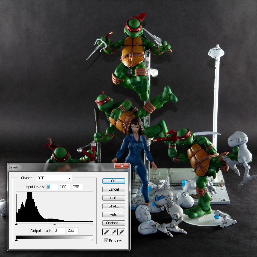
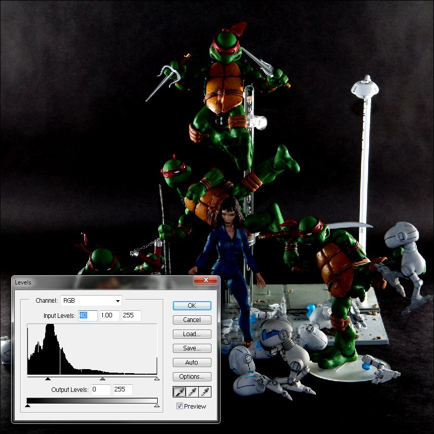
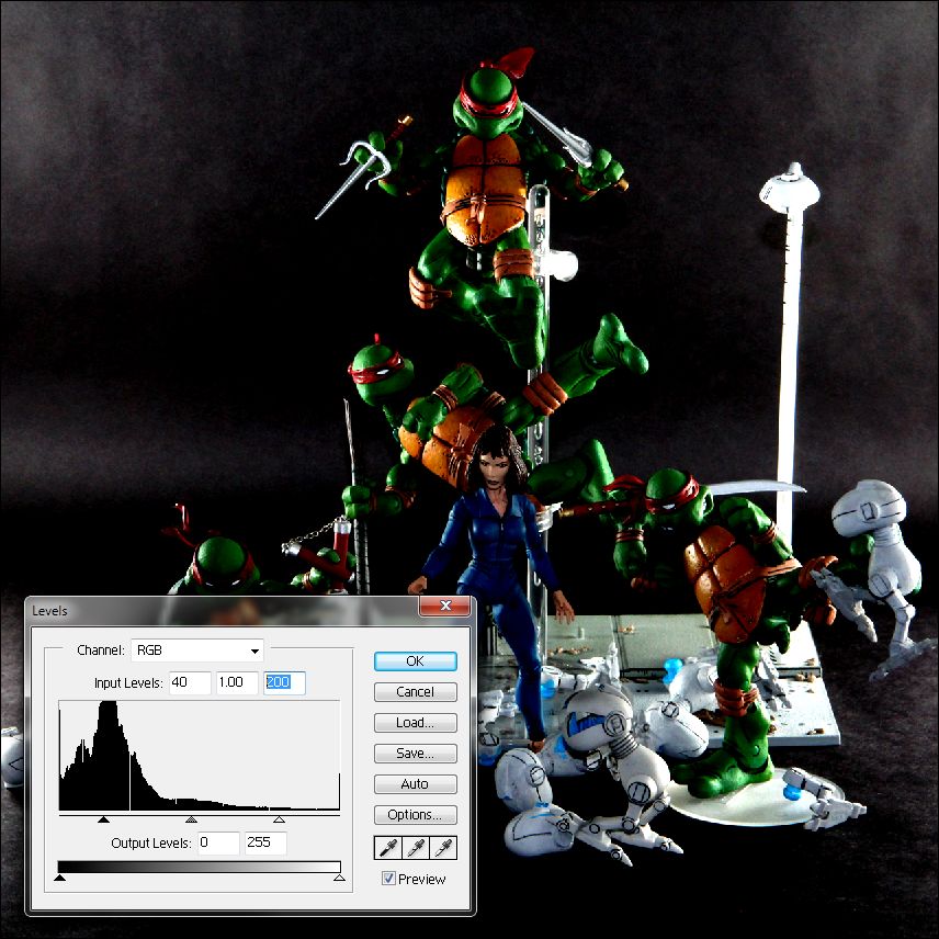
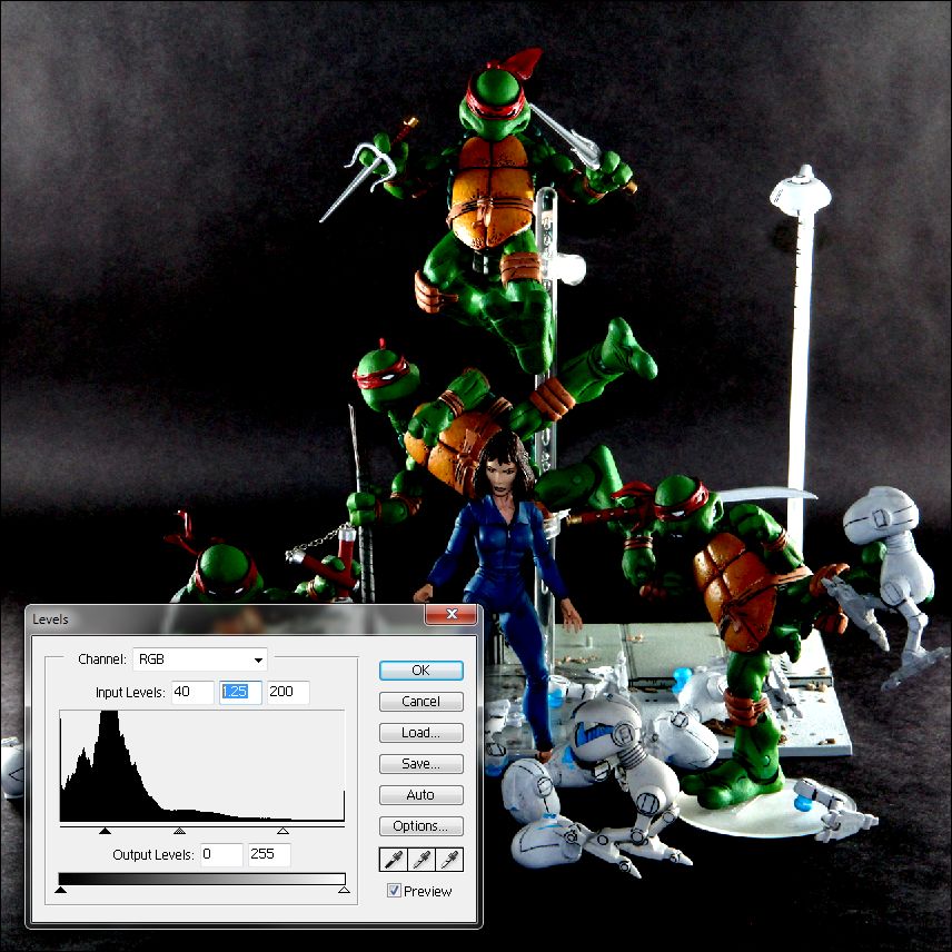
Image > Adjustments > Levels… is a tool in Photoshop (and other image editors) that lets you adjust the brightness, contrast, and tone of your pictures. In the series of images above, you’ll see the Levels tool overlaid, showing the settings and how it’s affected the shot. I’ll be working with the 3 Input Levels boxes, which are also represented by the 3 triangles under the graph. That graph is called a histogram, and it shows how much of the image is pure black (on the left), how much of it is pure white (on the right), and how much of it falls in between.
The histogram is unique for every picture – and what you can see in the leftmost image, which is the original, is that there’s a fair amount of dark in the shot already, as evidenced by the histogram being heavy on the left side. What I’ll be doing is stretching and adjusting that histogram to alter the shape of that histogram – in other words, adjusting how much black, white, and in between we’ll see in the modified picture.
In the second image, I’ve made an adjustment to the “black point” – the first box is now at 40 (instead of 0) and you can see that the black triangle under the histogram is shifted to the right. Basically, everything at that point and to the left of it is now pure black – that stuff, mostly the shadows and background which were dark before, is now black.
The third image shows the adjustment I’ve made to the “white point” – the third box is now at 200 (instead of 255) and you can see that the white triangle under the histogram is shifted to the left. Everything at the white point and to the right of it is now pure white – the highlights which were bright before are now brighter.
Finally, I’ve adjusted the “midtone level” – the second box is at 1.25 (instead of 1.00) and you can see that the gray triangle under the histogram is shifted to the left. The midtone level works in conjunction with the black and white points to alter the shape of the histogram. I’ve shifted it to the left, so everything between the black point and the mid point has been compressed, while everything between the mid point and the white point has been stretched – this has the effect of brightening the image. If I had moved it to the right, I would darken the image by stretching out the darks and compressing the lights.
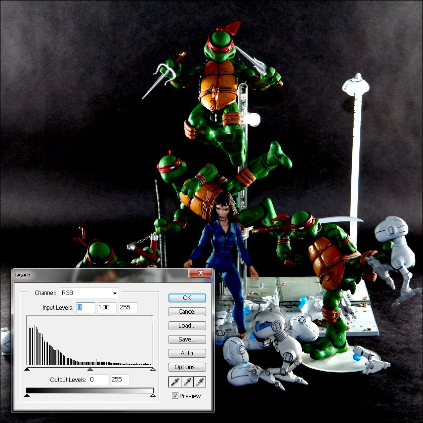
After clicking OK, Photoshop locks in the adjustments to the histogram and your image gets updated. Re-opening the Levels tool shows off the adjusted histogram – you’ll notice that the input levels are reset to 0 for the black point, 1.00 for the midtone level, and 255 for the white point.
If you’re looking to give your pictures a little more oomph, give the Levels tool a try. Don’t be afraid to experiment – you can always Undo!

I also took a shot with a standard lighting setup – this is with my remote flashes set up at 45 degree angles in front of the figures.
And here’s some replies for the guys who commented on the setup shots that I tweeted via Instagram (follow me at afpron, for AFP Ron, not action figure prOn :D):
- @fireball13z – not getting Shredder and the Foot in this line is one of the biggest action figure travesties in action figure history. I’d also kill for a NECA Casey Jones.
- @BillyBrownBear – Raph and Don are propped up on a clear acrylic stand that’s typically used for 1/6 figures – I just used 2 attachments on one rod so I could prop both of them up. I don’t remember the particular make and model of this stand, but the ones I’ll pick up next are Obitsu stands
. They have articulated arms and a bunch of attachments for different posing options.
- @skleefeld – you can still find lots of sets of the Turtles on ebay
for roughly $20 each, but with these being out of circulation for so long I wonder if these are figures that the original factories have kept producing without NECA’s involvement.
Thanks for the tweets, guys!
Finally, some thanks to Ibentmyman-thing from Fwoosh – years ago he molded up some NECA Mousers for his own army building purposes. I asked him back then if he would send me some reject casts, and he sent me a couple complete bodies and a bunch of body parts. I finally got off my butt to paint them (I did a horrible job) for this shot.
One thought on “NECA Teenage Mutant Ninja Turtles – Using Photoshop Levels to Enhance Dramatic Lighting”
Comments are closed.